Light Makes Wright: James Turrell at the Guggenheim

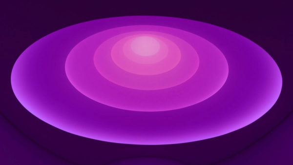
Light is everywhere, and yet too often familiarity blinds us to its power and possibilities. In his monolithic new installation Aten Reign artist James Turrell provides a striking reminder of the power of light to affect our spatial experiences. The exhibit remains at the Guggenheim Museum in New York City through September 25.
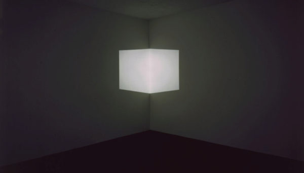
Exploring light and the way we perceive light is Turrell’s life’s work. His first insights came from experiments in projecting white light from a slide projector onto the bare walls of his first studio. Turning the projector to face the corner of the room, Turrell discovered that from a distance, the planes of light actually seemed to pop off the walls, forming a luminous cube nestled in the corner of the room. Insubstantial light came to occupy physical space in this piece, which he calls Afrum.
Turrell spent the year after creating Afrum covering the windows of his studio with black paint and cutting careful apertures in the walls. In his Mendota Stoppages (1969 – 1970), he led groups of visitors through his darkened studio in the evenings, opening the apertures in the walls to reveal light from the outside: orange, emerald green, pure white. At the end of the performance, which lasted several hours, the visitors were allowed outside, where they discovered that the fragment of orange light had been a neon light in a store window, the green a traffic light, the white a street lamp. Afrum and the Mendota Stoppages reveal two attitudes that pervade Turrell’s work: his treatment of light as a material, and his desire to enrich and deepen viewers’ experiences of everyday visual phenomena.
Although these first works were small, Turrell is no stranger to large-scale museum installations like that at the Guggenheim. In 1997, he created an installation for the opening of the Kunsthaus museum in Bregenz, Austria. The Kunsthaus is a cube sheathed by a double wall of semi-transparent glass. The void between the glass walls accepted light from the outside and filtered it into the galleries. The light entered the galleries discreetly, illumination made mysterious by the concealment of its source.
Turrell’s installation filled the double-walled void on the outside of the building with colored light. From a distance, the light drew attention to the geometric purity of the building’s form and the crystalline quality lent the building by its enveloping glazing. Inside the galleries, the novelty of the colored light exposed the tantalizing proximity of the outdoors to the heart of the museum. The Kunsthaus installation affirmed the intrinsic qualities of the building. The relationship of Aten Reign to the Guggenheim is more complicated.
Enter the museum by the main entrance. The ticketing room is darkened, so that the ceiling feels much lower than it is. Colored light behind the double doors at the far end of the space beckons you towards the rotunda and Turrell’s installation. Entering the rotunda, you first notice the people – people standing, reclining on benches, lying on cushions on the floor – all staring up. Then your gaze too is drawn upwards, into the vast shifting colors of Aten Reign.
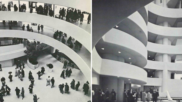
It is here on the floor of the rotunda that you first feel the effects of the installation on the architectural experience of the museum. The Guggenheim is a social space. This was radical in 1959 when the museum opened; in traditional museums, the focus is on the art – if for no other reason, because boxy galleries leave nowhere else to look. At the Guggenheim, a visitor descending the spiral is normally presented with two views: to the left, the artwork, placed on the outer wall of the spiral ramp; to the right, over the balcony, the entire interior life of the museum. The skylight above, the rotunda floor beneath, and the coils of the other side of the spiral seen from across the void are architectural drama at its finest. The sheer spectacle of this view, and the recognition that the building is meant to be appreciated as a work of art in its own right, make it acceptable for visitors to turn away from the artwork, lean on the balustrade, and watch the human life of the museum, their fellow museum-goers across the spiral.

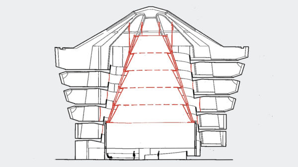
Aten Reign returns the museum to a more solitary, introverted ideal. The piece occupies the entire six-story rotunda and is created by a six-tiered cone of white fabric suspended from the top of the rotunda lit from behind by countless LED lights. The scrim used to create the installation hides the museum’s spiral ramp. As your head turns back and your eyes upwards, the crowds on the floor of the rotunda vanish, and you become aware of the purity and simplicity of Aten Reign. The luminous ovals are uncluttered – no crowds up here! The diagonal lines of the spiral ramp are restless and dynamic. The horizontal structure of the installation communicates stability, an architectural reassurance that this is a safe place for repose and meditation. Aten Reign embraces the teeming crowds below calmly, quietly, without brimming over. Gone – until September 25th – are the days when one looked up and saw spectators looking down or across from every level of the spiral ramp. No matter how full the rotunda, each visitor experiences Aten Reign alone.
The continuity of Frank Lloyd Wright’s exhibition spaces here was just as revolutionary and just as shocking as their sociability. Previous museums had conformed to traditional notions of architecture in which the interior is divided up into a series of self-contained exhibition spaces. At the Guggenheim, Wright erased internal barriers by casting the primary exhibition space as a continuous spiral ramp. The ramp, open to the central rotunda along its entire length, allowed space to flow freely and united the entire museum within a single enormous room.
Aten Reign divides this space in two, defining a clear interior and exterior. As you leave the rotunda and begin your sloping ascent through the museum, you move to the exterior of the installation. Like the back of a big-box retail store, the exterior of the installation is all business: a plain fabric scrim – undecorated by LED lights – sealing off the gap between the balustrade and the ceiling. Visitors are expected to ignore this part of the installation. It’s meant to be unobtrusive, not to encourage meditation or provoke insights – yet its effects on the architectural experience of the museum are significant.
The fabric scrim hides the rotunda and blocks those cross-atrium views that animate the museum. The openness of Wright’s design ensures that visitors are always aware of their position within the structure. Turrell’s installation replaces Wright’s open space with a whitewashed tunnel. Wright’s radical experiment with the infinite linear extension of space produced the Guggenheim; the backside of Aten Reign exposes this flirtation with infinity in a new way. The curve of the spiral limits the pedestrian’s scope of vision to thirty feet in front.and behind. There is no beginning or end, just the promise of the unknown beyond the curve of the walls. This is a different kind of isolation than the solitude of Aten Reign proper: harsher, more uncomfortable.

Aten Reign and the other installations present at the Guggenheim for this exhibition – Afrum, Ronin, Iltar – are typical of Turrell’s work in that the apparatus used are always carefully concealed. The white scrim sealing off the gap between the ramp and the rotunda bears evidence to this; its purpose is to hide the metal scaffolding and LED lights used to create Aten Reign.
When I saw Afrum at the Guggenheim, I walked into the room and stood at a distance from the cube. I was self-conscious: I was noticing myself noticing the light. Meanwhile, behind me, several children – surely not more than five years old – entered the room. Followed by several mothers, they ran up to the cube of light at the corner of room, putting their hands in it and laughing at the shadows it made. The bright light of the projector mounted high in the opposite wall caught the eye of one of these toddlers, and he turned: “Look!,” he pointed, and the other toddlers turned too, gazing up at the source of the light. That gave their mothers enough time to catch them and tow them out of the room – but they left a lasting impression on me.
Turrell is a master of illusion – and, as with all illusions, we – the viewers – are complicit in the deception. We agree to look only at the light, forgetting its origin. The Afrum toddlers reminded me that all of Turrell’s works have a source. The light and the apparatus used to produce the light together produce an effect that is far more powerful than either alone.

The Kunsthaus installation is simpler because its apparatus was more easily concealed and so intruded less into the life of the museum. Aten Reign, by contrast, pushes into every part of the space. Sometimes, as on the ramp, its intrusions are uncomfortable and uncomplimentary. Its secret is that the architectural extremes that Frank Lloyd Wright sought to capture are exposed most clearly in these moments.
It is rare that a remarkable building is so drastically altered, or that the result should be so illuminating. Turrell’s Aten Reign is an important moment of reflection in the architectural life of the Guggenheim Museum.